Home Search Gallery How-To Books Links Workshops About Contact
|
How
to Use the Nikon D50
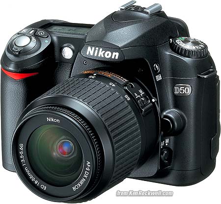
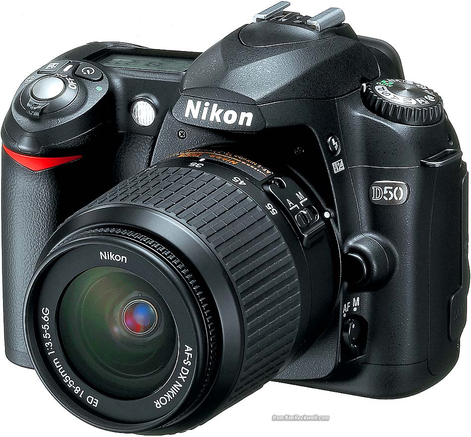
D50 with 18 - 55 mm. I'd get it here or here. enlarge MENUS: SHOOTING MENU (camera icon) back to top Press MENU and then select the camera (shooting) icon to get to the shooting menu. OPTIMIZE IMAGE: This is where you can program the look of an image. You can mimic the effects for which we used to have to select different kinds of film. There are choices of several canned presets, as well as CUSTOM, which lets you set your own. Remember to select DONE or OK when playing with the Optimize Image settings, otherwise it won't remember! You can swap between your custom setting below and a canned preset, like PORTRAIT, by spinning the top left mode knob. Custom settings apply in the P, S, A and M modes, but not in the SPORTS, PORTRAIT, etc. modes. The dummy modes like PORTRAIT override most of your manual settings, and the camera reverts to your special settings when you return from one of the dummy modes. There's nothing wrong with the dummy modes; use them if they save you time. I use the PORTRAIT mode for people since I usually have my camera's colors cranked up. The mode knob makes it easy to swap. Canned Settings: I don't use Nikon's canned Optimize Image presets of Normal, Vivid, Sharper, Softer, Direct Print, Portrait or Landscape. Feel free to play with them yourself. This is a beauty of the D50: you can use whatever works for you. I prefer my custom settings below because I prefer to leave the chroma cranked all the way up and let the camera automatically control contrast and sharpening as conditions change. Your style of photography will differ. You can look at the images made with each of the canned settings directly to see how you like them. You also can use Nikon's free Nikon View software or look at the data on the D50 itself to read what values of contrast, sharpening, color, etc, were used for each preset. The reason I skip the VIVID preset is because it selects Mode IIIa, but leave the saturation at normal. I explain these below. For photos of people I either set the colors back to normal, or cheat and use the Portrait preset mode on the top dial. As mentioned on the top page, using the preset scene modes on the top dial often override any settings you've made. I only use P, S, A and M modes which unlock all the adjustments. Of course using the top dial's Portrait mode sets the colors optimally for portraits, and sets it all back when I spin that dial back to P, S, A or M. This trick saves me a lot of clicking around under Optimize Image, but also eliminates my ability to alter the White Balance while in the top dial's portrait scene mode. Optimize Image Custom Settings As mentioned on the first page, I prefer the vivid color I get from Fuji's Velvia 50 film, so I tweak the D50 to give color as vivid as I can get. To do this I go to MENU > Shooting Menu (camera icon) > Optimize Image > Custom > (set Saturation to + and Color Mode to IIIa) > - - Done > OK. If you forget to select "- - Done" and hit OK it won't remember these settings! Here are what each setting inside the Custom option of Optimize Image does. Sharpening: I leave mine on AUTO. I've never messed with the manual settings. Sharpening is an artificial effect not to be confused with sharpness. When I first got a digital camera I thought: "cool, I'm cranking this to 11," and realized my error. Don't turn it up for no reason, since the image can start to look artificial. Play with it if you want. I've played with it out of curiosity, and always leave it on AUTO. Tone Compensation: This is Nikon's code word for Contrast.. I always leave mine set to AUTO. In AUTO the D50 automatically applies the Zone System and adjusts contrast to match your subject, for each and every shot! The D50 automatically lowers contrast and increases dynamic range for very contrasty subjects, and cranks it up for dull subjects. I've played with the manual settings out of curiosity. Saturation varies a little with contrast, too. If you crank it to +2 it looks vivid and bold for flatter subjects, but when you have a contrasty subject it's too much and blows out. Leave it in AUTO and you won't have to piddle with it. AUTO works great. The CUSTOM Tone Compensation setting (scroll down) is for hackers. If you pay Nikon $100 for Nikon Capture software you can create your own crazy H&D curves and then go out of your way to load them into your D50. Once you create and load them you no longer need the software. Custom curves are way beyond anything with which I want to bother. Real photographers pay more attention to their subject's lighting. Color Mode has three settings: Mode Ia is default. It's Nikon's secret code for standard sRGB. sRGB is the world standard for digital images and the Internet. Mode II is secret code for Adobe RGB, which only hackers use. Adobe RGB gives dull colors when used by anyone other than an expert in color management who prints his own work. Even if you're an expert, if you send your work out for printing, 90% of the time the people doing the printing aren't experts and screw it up for you. Ignore desktop armchair hobbyists who bleat on about the broader color gamut of Adobe RGB. I've created and printed 100% chroma grads in Adobe RGB and sRGB and saw no difference when printed either on Inkjets or on the $250,000 Lightjet 5000 on Fuji Supergloss. Oh well! Using Adobe RGB is asking for trouble unless you really know what you're doing and have complete control over your process. If you have to ask, don't use Adobe RGB. Mode IIIa is secret code for a standard sRGB mode which gives bolder color. I use this all the time. No, I have no idea how Nikon cooked up these numeric designations. Saturation is the vividness of colors. + Enhanced: I prefer violent color, so I crank it up to +. I'd use ++ or +++ if my D50 had it. 0 Normal: For normal people shots you're probably better off with 0. This is the default. There is no AUTO saturation as on the D200, and on my D200 I leave it cranked to + anyway. - Moderate: - tones down the colors, which I've never liked. Moderate sounds like British understatement. In America we call this "dull and boring." Personally I want colors so bright you have to put on sunglasses, or go directly to B/W. Your interests and taste will differ. There is no native B/W mode in the D50. Hue Adjustment: Don't touch this! This rotates all your colors to different spots around the color wheel. If you use this to fix one color it screws up all the other colors. God only knows why this adjustment is here. - - DONE: This is important: after you play with all the above Optimize Image settings you must select "- - DONE" and "OK" for them to be remembered and take effect. I never trust this and go back in and check that my settings took hold. LONG EXPOSURE NOISE REDUCTION (NR): Forget this. It slows the camera frame rate down to half! If you make exposures of a minute or more it will get rid of the minor purple haze in the corners, but in exchange you have to wait around in the dark for another blank exposure as long as your first time exposure! The D50 uses the second exposure as a reference to subtract from the first image to eliminate any camera-induced hot pixels or haze. Engineers call this "dark frame subtraction." You can see examples of this haze on my D200 Dark Exposure page. I've never seen this haze in any real night photography. It only becomes apparent for astronomically long exposures of darkness (pun intended). The D50 isn't smart enough to disable this automatically at normal shutter speeds, so if you forget and leave it on your frame rate slows to a crawl even in daylight. I never use this setting. IMAGE QUALITY: This duplicates half of the QUAL button. I only use this menu if I want to see this on the back of the camera instead of the top LCD. IMAGE SIZE: This duplicates the other half of the QUAL button. I only use this if I want to see this on the back of the camera instead of the top LCD. WHITE BALANCE: This duplicates the WB button. I only use this menu if I want to see this on the back of the camera instead of the top LCD. ISO: This duplicates the ISO button. I only use this menu if I want to see this on the back of the camera instead of the top LCD. I explain the buttons duplicated by these menus here. If you find this as helpful as a book you might have had to buy, feel free to help me write more with a donation. Thanks! Ken. CONTROLS (every button and knob) MENUS (every menu item in detail) CUSTOM SETTINGS < < NEXT |

